Posts

Showing posts from February, 2018

Adobe Photoshop & InDesign - Laser Pets

Image
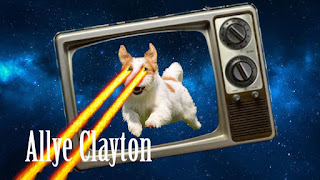
Class is never boring here! We got to build a laser pet in Photoshop and a business card in InDesign. I'll take you through my step-by-step process you, too, can build your own laser pet! 1) I took a basic galaxy backdrop and threw it into Photoshop - This is your background 2) In another Photoshop tab, I found an old tv set. With the selection tool, I selected the parts of the tv I wanted to keep. Next, take your mouse tool, should be the first tool with a mouse and arrows, grab your tv set and hover it over the tab with your galaxy background. Don't release it until your tabs switch over! This tv will be a new layer. 3) We're going to repeat the last step but with an animal instead. Once you've got your pet all set, drag him over to your background tab. The pet will be another layer. 4) Finally, we're going to add lasers! I went to Google and found a png file with lasers. A png file will allow you to simply drag the item over. So, I've eliminated a

Rhetorical Analysis: Visual-Verbal Text

Image
For my analysis, I would like to spend some time looking at a logo for a team that is very near and dear to my heart. My bowling team. This is the current logo for our team. It is on all of our scoring sheets, our website and it's our cover photo for Twitter. We had to do some re-branding because Club Sports here at Ball State wanted us to include "club" in there since we are a Club Sport and go through Rec Services for everything. The paperwork, the eligibility, forms that allow us to travel and our team board has so many meetings throughout the year that it becomes a little bit ridiculous. Now, let's get to the analysis part of this post. The overall logo isn't terrible. It gets the point across that we are a women's bowling club here at Ball State, but that's all that it does. To me, it is very clunky and hard to follow from left to right. "Ball State" is a bit too close together, "club" is way too big and prominent, there i

MOTOR MVB Focal Topic

This semester, I get to be part of an immersive learning class that is working for MOTOR MVB. Now, what is MOTOR MVB and what is the mission?   MOTOR MVB expands education opportunities at college and universities so student-athletes can receive scholarships, compete on the court, get a college education, and grow as leaders. MOTOR stands for Making Opportunities & Transforming Our Reach and MVB stands for Men's Volleyball.  On this team, I am part of the branch that does everything at the collegiate level. In January, I went to Nashville and got to shoot and report on different teams, coaches, players, parents and even the event coordinator, Vinnie Lopes who is a Ball State alum! I want to help grow the game, but I also want to help show that volleyball isn't just  a female sport. Men can do it too and they're pretty dang good at it.  For this project, I want to help improve the photo layouts and dabble a little bit in the graphics portion. We have Facebook, Twitte

My Personal Brand Logo

Image
As a photographer, I really want to show the world that I'm different than other photographers. There's always that factor of not standing out enough in the crowd. I believe that the only way to truly show who you are is through a very personal brand. I've created one to showcase. I think that because I spell my name so uniquely, it gives way to showing that my personality matches the name. I did most of the branding in photoshop. I would like to take you through the process! First, I scoured the internet looking for the perfect font. I wanted something that was fun, curly and easily read. I believe I accomplished this. Once I found the font, Stea from 1001 Fonts, I knew that it fit what I was looking for. It's got that perfect amount of "curliness" that I was looking for and it spaced out nicely to fill the page. I put it into photoshop and cut out just my name and saved it as a .png file so I could overlay it on my background later. I went on to f